
Bootstrap 5.0定价表
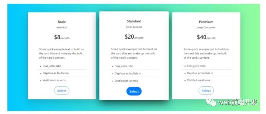
代码如下:
<html lang="en"><head><!-- Required meta tags --><meta charset="utf-8"><meta name="viewport" content="width=device-width, initial-scale=1"><!-- Bootstrap CSS --><link href="https://cdn.jsdelivr.net/npm/[email protected]/dist/css/bootstrap.min.css" rel="stylesheet" integrity="sha384-giJF6kkoqNQ00vy+HMDP7azOuL0xtbfIcaT9wjKHr8RbDVddVHyTfAAsrekwKmP1" crossorigin="anonymous"><title>Bootstrap 5.0 Pricing Table</title><style>.card {border:none;padding: 10px 50px;}.card::after {position: absolute;z-index: -1;opacity: 0;-webkit-transition: all 0.6s cubic-bezier(0.165, 0.84, 0.44, 1);transition: all 0.6s cubic-bezier(0.165, 0.84, 0.44, 1);}.card:hover {transform: scale(1.02, 1.02);-webkit-transform: scale(1.02, 1.02);backface-visibility: hidden;will-change: transform;box-shadow: 0 1rem 3rem rgba(0,0,0,.75) ;}.card:hover::after {opacity: 1;}.card:hover .btn-outline-primary{color:white;background:#007bff;}</style></head><body><div class="container-fluid" style="background: linear-gradient(90deg, #00C9FF 0%, #92FE9D 100%);"><div class="container p-5"><div class="row"><div class="col-lg-4 col-md-12 mb-4"><div class="card h-100 shadow-lg"><div class="card-body"><div class="text-center p-3"><h5 class="card-title">Basic</h5><small>Individual</small><br><br><span class="h2">$8</span>/month<br><br></div><p class="card-text">Some quick example text to build on the card title and make up the bulk of the card's content.</p></div><ul class="list-group list-group-flush"><li class="list-group-item"><svg xmlns="http://www.w3.org/2000/svg" width="16" height="16" fill="currentColor" class="bi bi-check" viewBox="0 0 16 16"><path d="M10.97 4.97a.75.75 0 0 1 1.07 1.05l-3.99 4.99a.75.75 0 0 1-1.08.02L4.324 8.384a.75.75 0 1 1 1.06-1.06l2.094 2.093 3.473-4.425a.267.267 0 0 1 .02-.022z"/></svg> Cras justo odio</li><li class="list-group-item"><svg xmlns="http://www.w3.org/2000/svg" width="16" height="16" fill="currentColor" class="bi bi-check" viewBox="0 0 16 16"><path d="M10.97 4.97a.75.75 0 0 1 1.07 1.05l-3.99 4.99a.75.75 0 0 1-1.08.02L4.324 8.384a.75.75 0 1 1 1.06-1.06l2.094 2.093 3.473-4.425a.267.267 0 0 1 .02-.022z"/></svg> Dapibus ac facilisis in</li><li class="list-group-item"><svg xmlns="http://www.w3.org/2000/svg" width="16" height="16" fill="currentColor" class="bi bi-check" viewBox="0 0 16 16"><path d="M10.97 4.97a.75.75 0 0 1 1.07 1.05l-3.99 4.99a.75.75 0 0 1-1.08.02L4.324 8.384a.75.75 0 1 1 1.06-1.06l2.094 2.093 3.473-4.425a.267.267 0 0 1 .02-.022z"/></svg> Vestibulum at eros</li></ul><div class="card-body text-center"><button class="btn btn-outline-primary btn-lg" style="border-radius:30px">Select</button></div></div></div><div class="col-lg-4 col-md-12 mb-4"><div class="card h-100 shadow-lg"><div class="card-body"><div class="text-center p-3"><h5 class="card-title">Standard</h5><small>Small Business</small><br><br><span class="h2">$20</span>/month<br><br></div><p class="card-text">Some quick example text to build on the card title and make up the bulk of the card's content.</p></div><ul class="list-group list-group-flush"><li class="list-group-item"><svg xmlns="http://www.w3.org/2000/svg" width="16" height="16" fill="currentColor" class="bi bi-check" viewBox="0 0 16 16"><path d="M10.97 4.97a.75.75 0 0 1 1.07 1.05l-3.99 4.99a.75.75 0 0 1-1.08.02L4.324 8.384a.75.75 0 1 1 1.06-1.06l2.094 2.093 3.473-4.425a.267.267 0 0 1 .02-.022z"/></svg> Cras justo odio</li><li class="list-group-item"><svg xmlns="http://www.w3.org/2000/svg" width="16" height="16" fill="currentColor" class="bi bi-check" viewBox="0 0 16 16"><path d="M10.97 4.97a.75.75 0 0 1 1.07 1.05l-3.99 4.99a.75.75 0 0 1-1.08.02L4.324 8.384a.75.75 0 1 1 1.06-1.06l2.094 2.093 3.473-4.425a.267.267 0 0 1 .02-.022z"/></svg> Dapibus ac facilisis in</li><li class="list-group-item"><svg xmlns="http://www.w3.org/2000/svg" width="16" height="16" fill="currentColor" class="bi bi-check" viewBox="0 0 16 16"><path d="M10.97 4.97a.75.75 0 0 1 1.07 1.05l-3.99 4.99a.75.75 0 0 1-1.08.02L4.324 8.384a.75.75 0 1 1 1.06-1.06l2.094 2.093 3.473-4.425a.267.267 0 0 1 .02-.022z"/></svg> Vestibulum at eros</li></ul><div class="card-body text-center"><button class="btn btn-outline-primary btn-lg" style="border-radius:30px">Select</button></div></div></div><div class="col-lg-4 col-md-12 mb-4"><div class="card h-100 shadow-lg"><div class="card-body"><div class="text-center p-3"><h5 class="card-title">Premium</h5><small>Large Companies</small><br><br><span class="h2">$40</span>/month<br><br></div><p class="card-text">Some quick example text to build on the card title and make up the bulk of the card's content.</p></div><ul class="list-group list-group-flush"><li class="list-group-item"><svg xmlns="http://www.w3.org/2000/svg" width="16" height="16" fill="currentColor" class="bi bi-check" viewBox="0 0 16 16"><path d="M10.97 4.97a.75.75 0 0 1 1.07 1.05l-3.99 4.99a.75.75 0 0 1-1.08.02L4.324 8.384a.75.75 0 1 1 1.06-1.06l2.094 2.093 3.473-4.425a.267.267 0 0 1 .02-.022z"/></svg> Cras justo odio</li><li class="list-group-item"><svg xmlns="http://www.w3.org/2000/svg" width="16" height="16" fill="currentColor" class="bi bi-check" viewBox="0 0 16 16"><path d="M10.97 4.97a.75.75 0 0 1 1.07 1.05l-3.99 4.99a.75.75 0 0 1-1.08.02L4.324 8.384a.75.75 0 1 1 1.06-1.06l2.094 2.093 3.473-4.425a.267.267 0 0 1 .02-.022z"/></svg> Dapibus ac facilisis in</li><li class="list-group-item"><svg xmlns="http://www.w3.org/2000/svg" width="16" height="16" fill="currentColor" class="bi bi-check" viewBox="0 0 16 16"><path d="M10.97 4.97a.75.75 0 0 1 1.07 1.05l-3.99 4.99a.75.75 0 0 1-1.08.02L4.324 8.384a.75.75 0 1 1 1.06-1.06l2.094 2.093 3.473-4.425a.267.267 0 0 1 .02-.022z"/></svg> Vestibulum at eros</li></ul><div class="card-body text-center"><button class="btn btn-outline-primary btn-lg" style="border-radius:30px">Select</button></div></div></div></div></div></body><!-- Option 1: Bootstrap Bundle with Popper --><script src="https://cdn.jsdelivr.net/npm/[email protected]/dist/js/bootstrap.bundle.min.js" integrity="sha384-ygbV9kiqUc6oa4msXn9868pTtWMgiQaeYH7/t7LECLbyPA2x65Kgf80OJFdroafW" crossorigin="anonymous"></script></body></html>
02、Bootstrap 5.0定价表-示例2
此价格设计具有悬停卡翻转功能,样式效果也非常不错。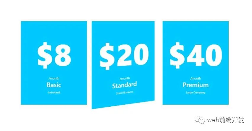
样式代码如下:
<html lang="en"><head><!-- Required meta tags --><meta charset="utf-8"><meta name="viewport" content="width=device-width, initial-scale=1"><!-- Bootstrap CSS --><link href="https://cdn.jsdelivr.net/npm/[email protected]/dist/css/bootstrap.min.css" rel="stylesheet" integrity="sha384-giJF6kkoqNQ00vy+HMDP7azOuL0xtbfIcaT9wjKHr8RbDVddVHyTfAAsrekwKmP1" crossorigin="anonymous"><title>Bootstrap 5.0 Pricing Table</title><style>.header {background:#00C9FF;}.bi {color:#00C9FF;}.price {color:white;font-size: 150px;font-weight: 800;padding-top:-80% ;}/* The flip card container - set the width and height to whatever you want. We have added the border property to demonstrate that the flip itself goes out of the box on hover (remove perspective if you don't want the 3D effect */.flip-card {background-color: transparent;width: auto;height: auto;perspective: 1000px; /* Remove this if you don't want the 3D effect */}/* This container is needed to position the front and back side */.flip-card-inner {position: relative;width: 100%;height: 100%;text-align: center;transition: transform 0.8s;transform-style: preserve-3d;}/* Do an horizontal flip when you move the mouse over the flip box container */.flip-card:hover .flip-card-inner {transform: rotateY(180deg);}/* Position the front and back side */.flip-card-front, .flip-card-back {position: absolute;width: 100%;height: 100%;-webkit-backface-visibility: hidden; /* Safari */backface-visibility: hidden;}/* Style the front side (fallback if image is missing) */.flip-card-front {background-color: #00C9FF;color: white;height: auto;padding:50px 0px;}/* Style the back side */.flip-card-back {background-color: white;color: black;transform: rotateY(180deg);padding:50px 0px;}</style></head><body><div class="container p-5"><div class="row"><div class="col-lg-4 col-md-12 mb-4"><div class="h-100 flip-card"><div class="flip-card-inner"><div class="flip-card-front"><span class="price">$8</span><br>/month<br><h2 class="card-title">Basic</h2><small>Individual</small></div><div class="flip-card-back"><ul class="list-group list-group-flush"><li class="list-group-item"><svg xmlns="http://www.w3.org/2000/svg" width="16" height="16" fill="currentColor" class="bi bi-check" viewBox="0 0 16 16"><path d="M10.97 4.97a.75.75 0 0 1 1.07 1.05l-3.99 4.99a.75.75 0 0 1-1.08.02L4.324 8.384a.75.75 0 1 1 1.06-1.06l2.094 2.093 3.473-4.425a.267.267 0 0 1 .02-.022z"/></svg> Cras justo odio</li><li class="list-group-item"><svg xmlns="http://www.w3.org/2000/svg" width="16" height="16" fill="currentColor" class="bi bi-check" viewBox="0 0 16 16"><path d="M10.97 4.97a.75.75 0 0 1 1.07 1.05l-3.99 4.99a.75.75 0 0 1-1.08.02L4.324 8.384a.75.75 0 1 1 1.06-1.06l2.094 2.093 3.473-4.425a.267.267 0 0 1 .02-.022z"/></svg> Dapibus ac facilisis in</li><li class="list-group-item"><svg xmlns="http://www.w3.org/2000/svg" width="16" height="16" fill="currentColor" class="bi bi-check" viewBox="0 0 16 16"><path d="M10.97 4.97a.75.75 0 0 1 1.07 1.05l-3.99 4.99a.75.75 0 0 1-1.08.02L4.324 8.384a.75.75 0 1 1 1.06-1.06l2.094 2.093 3.473-4.425a.267.267 0 0 1 .02-.022z"/></svg> Vestibulum at eros</li></ul><button class="my-5 btn btn-outline-success btn-lg">Select</button></div></div></div></div><div class="col-lg-4 col-md-12 mb-4"><div class="h-100 flip-card"><div class="flip-card-inner"><div class="flip-card-front"><span class="price">$20</span><br>/month<br><h2 class="card-title">Standard</h2><small>Small Business</small></div><div class="flip-card-back"><ul class="list-group list-group-flush"><li class="list-group-item"><svg xmlns="http://www.w3.org/2000/svg" width="16" height="16" fill="currentColor" class="bi bi-check" viewBox="0 0 16 16"><path d="M10.97 4.97a.75.75 0 0 1 1.07 1.05l-3.99 4.99a.75.75 0 0 1-1.08.02L4.324 8.384a.75.75 0 1 1 1.06-1.06l2.094 2.093 3.473-4.425a.267.267 0 0 1 .02-.022z"/></svg> Cras justo odio</li><li class="list-group-item"><svg xmlns="http://www.w3.org/2000/svg" width="16" height="16" fill="currentColor" class="bi bi-check" viewBox="0 0 16 16"><path d="M10.97 4.97a.75.75 0 0 1 1.07 1.05l-3.99 4.99a.75.75 0 0 1-1.08.02L4.324 8.384a.75.75 0 1 1 1.06-1.06l2.094 2.093 3.473-4.425a.267.267 0 0 1 .02-.022z"/></svg> Dapibus ac facilisis in</li><li class="list-group-item"><svg xmlns="http://www.w3.org/2000/svg" width="16" height="16" fill="currentColor" class="bi bi-check" viewBox="0 0 16 16"><path d="M10.97 4.97a.75.75 0 0 1 1.07 1.05l-3.99 4.99a.75.75 0 0 1-1.08.02L4.324 8.384a.75.75 0 1 1 1.06-1.06l2.094 2.093 3.473-4.425a.267.267 0 0 1 .02-.022z"/></svg> Vestibulum at eros</li></ul><button class="my-5 btn btn-outline-success btn-lg">Select</button></div></div></div></div><div class="col-lg-4 col-md-12 mb-4"><div class="h-100 flip-card"><div class="flip-card-inner"><div class="flip-card-front"><span class="price">$40</span><br>/month<br><h2 class="card-title">Premium</h2><small>Large Company</small></div><div class="flip-card-back"><ul class="list-group list-group-flush"><li class="list-group-item"><svg xmlns="http://www.w3.org/2000/svg" width="16" height="16" fill="currentColor" class="bi bi-check" viewBox="0 0 16 16"><path d="M10.97 4.97a.75.75 0 0 1 1.07 1.05l-3.99 4.99a.75.75 0 0 1-1.08.02L4.324 8.384a.75.75 0 1 1 1.06-1.06l2.094 2.093 3.473-4.425a.267.267 0 0 1 .02-.022z"/></svg> Cras justo odio</li><li class="list-group-item"><svg xmlns="http://www.w3.org/2000/svg" width="16" height="16" fill="currentColor" class="bi bi-check" viewBox="0 0 16 16"><path d="M10.97 4.97a.75.75 0 0 1 1.07 1.05l-3.99 4.99a.75.75 0 0 1-1.08.02L4.324 8.384a.75.75 0 1 1 1.06-1.06l2.094 2.093 3.473-4.425a.267.267 0 0 1 .02-.022z"/></svg> Dapibus ac facilisis in</li><li class="list-group-item"><svg xmlns="http://www.w3.org/2000/svg" width="16" height="16" fill="currentColor" class="bi bi-check" viewBox="0 0 16 16"><path d="M10.97 4.97a.75.75 0 0 1 1.07 1.05l-3.99 4.99a.75.75 0 0 1-1.08.02L4.324 8.384a.75.75 0 1 1 1.06-1.06l2.094 2.093 3.473-4.425a.267.267 0 0 1 .02-.022z"/></svg> Vestibulum at eros</li></ul><button class="my-5 btn btn-outline-success btn-lg">Select</button></div></div></div></div></div></div></body><!-- Option 1: Bootstrap Bundle with Popper --><script src="https://cdn.jsdelivr.net/npm/[email protected]/dist/js/bootstrap.bundle.min.js" integrity="sha384-ygbV9kiqUc6oa4msXn9868pTtWMgiQaeYH7/t7LECLbyPA2x65Kgf80OJFdroafW" crossorigin="anonymous"></script></body></html>
03、Bootstrap 5.0定价表—示例3
此示例是价格表的简化版本,在悬停时有颜色。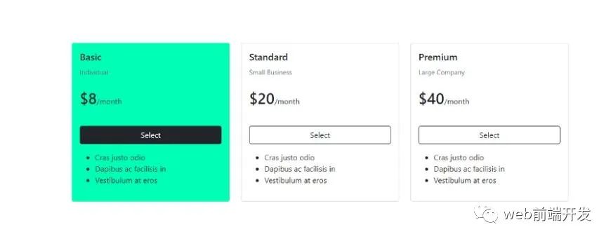
代码如下:
<html lang="en"><head><!-- Required meta tags --><meta charset="utf-8"><meta name="viewport" content="width=device-width, initial-scale=1"><!-- Bootstrap CSS --><link href="https://cdn.jsdelivr.net/npm/[email protected]/dist/css/bootstrap.min.css" rel="stylesheet" integrity="sha384-giJF6kkoqNQ00vy+HMDP7azOuL0xtbfIcaT9wjKHr8RbDVddVHyTfAAsrekwKmP1" crossorigin="anonymous"><title>Bootstrap 5.0 Pricing Table</title><style>.card1:hover {background:#00ffb6;border:1px solid #00ffb6;}.card1:hover .list-group-item{background:#00ffb6}.card2:hover {background:#00C9FF;border:1px solid #00C9FF;}.card2:hover .list-group-item{background:#00C9FF}.card3:hover {background:#ff95e9;border:1px solid #ff95e9;}.card3:hover .list-group-item{background:#ff95e9}.card:hover .btn-outline-dark{color:white;background:#212529;}</style></head><body><div class="container-fluid"><div class="container p-5"><div class="row"><div class="col-lg-4 col-md-12 mb-4"><div class="card card1 h-100"><div class="card-body"><h5 class="card-title">Basic</h5><small class='text-muted'>Individual</small><br><br><span class="h2">$8</span>/month<br><br><div class="d-grid my-3"><button class="btn btn-outline-dark btn-block">Select</button></div><ul><li>Cras justo odio</li><li>Dapibus ac facilisis in</li><li>Vestibulum at eros</li></ul></div></div></div><div class="col-lg-4 col-md-12 mb-4"><div class="card card2 h-100"><div class="card-body"><h5 class="card-title">Standard</h5><small class='text-muted'>Small Business</small><br><br><span class="h2">$20</span>/month<br><br><div class="d-grid my-3"><button class="btn btn-outline-dark btn-block">Select</button></div><ul><li>Cras justo odio</li><li>Dapibus ac facilisis in</li><li>Vestibulum at eros</li></ul></div></div></div><div class="col-lg-4 col-md-12 mb-4"><div class="card card3 h-100"><div class="card-body"><h5 class="card-title">Premium</h5><small class='text-muted'>Large Company</small><br><br><span class="h2">$40</span>/month<br><br><div class="d-grid my-3"><button class="btn btn-outline-dark btn-block">Select</button></div><ul><li>Cras justo odio</li><li>Dapibus ac facilisis in</li><li>Vestibulum at eros</li></ul></div></div></div></div></div></body><!-- Option 1: Bootstrap Bundle with Popper --><script src="https://cdn.jsdelivr.net/npm/[email protected]/dist/js/bootstrap.bundle.min.js" integrity="sha384-ygbV9kiqUc6oa4msXn9868pTtWMgiQaeYH7/t7LECLbyPA2x65Kgf80OJFdroafW" crossorigin="anonymous"></script></body></html>
CodePen里的定价表案例
现在,我们再来看一些CodePen Bootstrap上的定价表示例。除了代码链接之外,下面还列出了每个CodePen创建者。
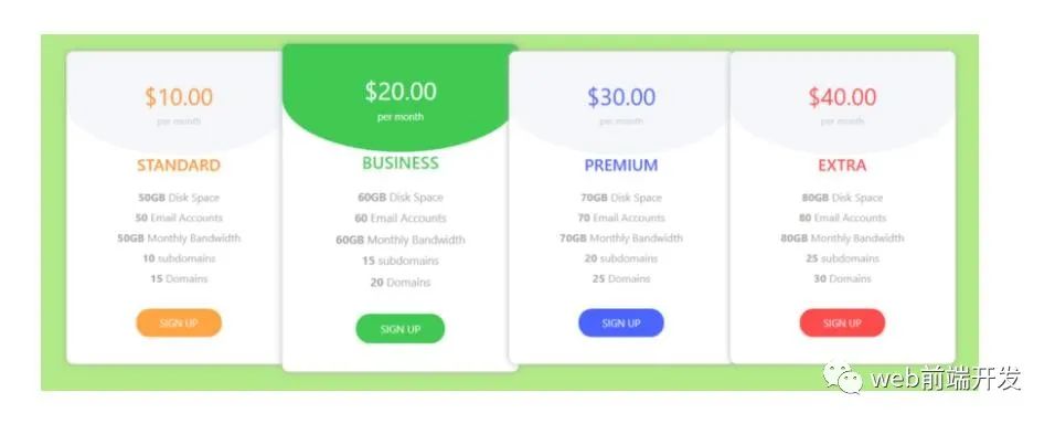
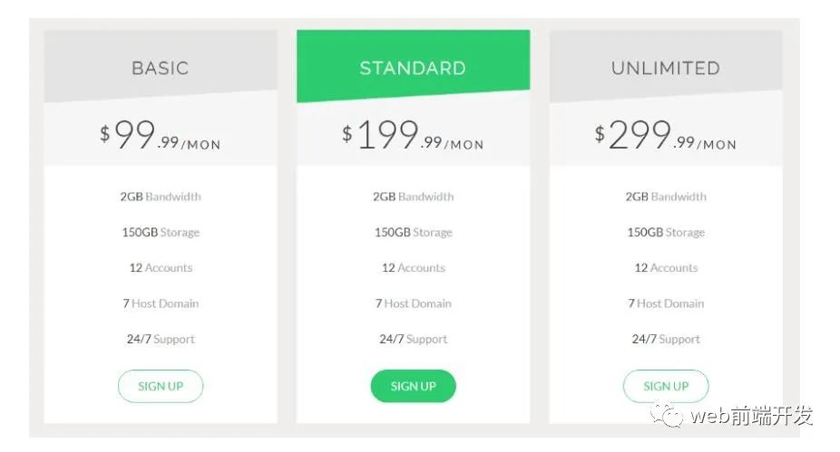
04、定价表
作者:普雷格·雷米(Prem Regmi)
定价表更多的是表而不是卡组。它旨在直接比较每个功能。
演示地址:https://codepen.io/regmiprem/embed/NRQZYz
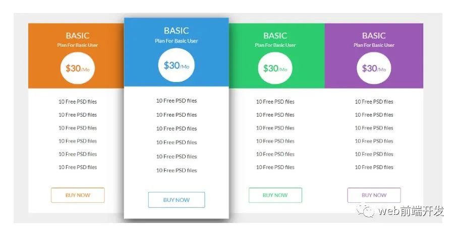
05、3D Bootstrap定价表
作者:Aashima
这款是比较典型的Bootstrap价格卡,并且实现了3D效果。其价格会在悬停时更改为薄荷绿色。
演示地址:https://codepen.io/Aashima/embed/PKgeoz
06、响应式定价表
作者:Anisur
这种设计是平坦的,直到你将鼠标悬停在卡片上,才会露出轻微的盒子阴影。此外,将鼠标悬停在该按钮上时,它会从左到右填充。
演示地址:https://codepen.io/idanisur/embed/preview/ZpPoKj
07、平面响应式定价表
作者:Anisur
此样式,在悬停时,缩放后的卡片后面会出现阴影,样式效果也非常漂亮。
演示地址:https://codepen.io/idanisur/embed/preview/amrEdQ
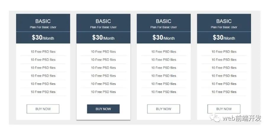
08、定价表
作者:GoSnippets
这是比较独特的一款Bootstrap定价表。卡从左到右堆叠,而表头在悬停时会更改颜色。
 演示地址:https://codepen.io/gosnippets/embed/preview/OJXZNRW
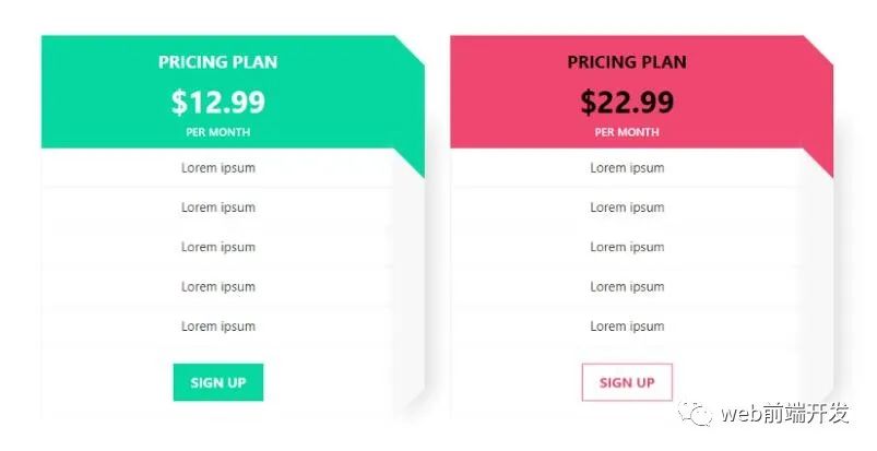
09、定价表
作者:萨哈尔·阿里·拉扎(Sahar Ali Raza)
作者采取了一种有角度的方法来介绍包装类型和价格。这是一个干净,简洁漂亮大方的设计样式。
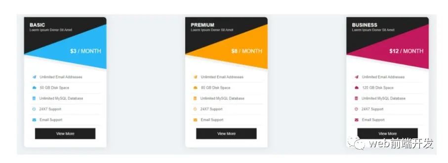
演示地址:https://codepen.io/mrsahar/embed/preview/oOrWEm
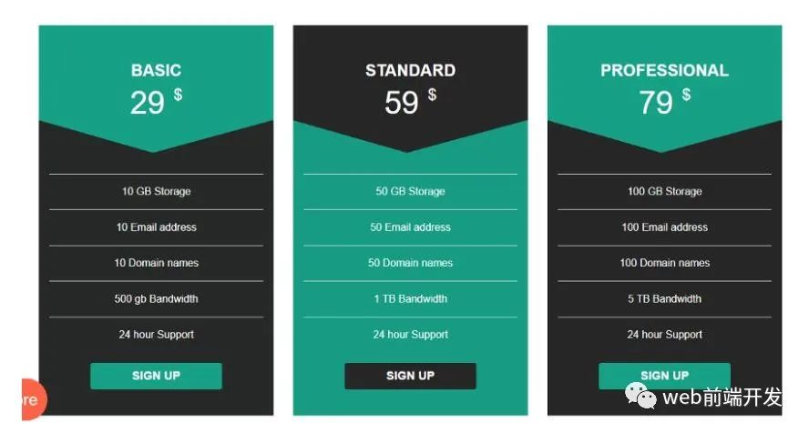
10、定价表
作者:萨哈尔·阿里·拉扎(Sahar Ali Raza)
该Boostrap定价表,它是一种角度较小的方法,具有较浅的调色板。
演示地址:https://codepen.io/mrsahar/embed/preview/yOVGBQ
11、定价表
作者:Divinector
今天文章里分享的最后一个Bootstrap定价表,是将悬停时的颜色反转,样式也非常漂亮。
演示地址:https://codepen.io/divinector/embed/preview/KKPvKLz
总结
在此之前,我也整理分享了很多了定价表的样式,有兴趣的话,可以自行点开文章去看看:《100款+CSS实现的定价表代码可免费下载使用》,今天翻译分享的这篇文章是来源Medium上的,看了里面案例不错,所以就整理了一下,文章翻译采用的是非直译,如果想阅读英文原文版的话,可以打开文章顶部的链接去进行学习。
最后,感谢你的阅读,编程快乐!学习快乐!
推荐阅读
学习更多技能
请点击下方公众号


文章评论