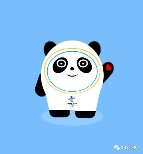
CSS3代码:
body {background: rgba(72, 167, 255, 0.733);overflow: hidden;width: 100%;height: 100%;}.main {width: 100px;margin: 10% auto;perspective: 300px;position: absolute;top: 20%;left: 50%;transform: translateX(-50%) scale(2);}.body {width: 100px;height: 100px;transform: rotate3d(-1, 0, 0, 47deg) scaleY(1.6);position: relative;}.bg {width: 100%;height: 100%;border-radius: 50%;background: #fff;}.leg {position: absolute;bottom: -8px;}.leg > .left {width: 40px;height: 50px;background: #fff;display: inline-block;transform: translateX(4px) rotateZ(-3deg);}.leg > .right {width: 40px;height: 50px;background: #fff;display: inline-block;transform: translateX(12px) rotateZ(3deg);}.foot {position: absolute;bottom: 2px;display: flex;justify-content: space-between;}.foot > .left {width: 40px;height: 16px;border-radius: 0 0 10px 10px;background: #000;transform: translateX(5px) rotateZ(0deg) translateY(20px);animation: foot-left .5s linear infinite alternate;}.foot > .right {width: 40px;height: 16px;border-radius: 0 0 10px 10px;background: #000;transform: translateX(16px) rotateZ(0deg) translateY(20px);animation: foot-right .5s linear infinite alternate-reverse;}@keyframes foot-left {from {transform: translateX(5px) rotateZ(0deg) translateY(18px);}to {transform: translateX(5px) rotateZ(0deg) translateY(20px);}}@keyframes foot-right {from {transform: translateX(16px) rotateZ(0deg) translateY(18px);}to {transform: translateX(16px) rotateZ(0deg) translateY(20px);}}.arm {position: absolute;top: 40px;z-index: -1;display: flex;justify-content: space-between;}.arm>.left, .arm>.right {border-radius: 10px;background: #000;width: 20px;height: 40px;transform-origin: center;}.arm>.left {transform: rotateZ(35deg) translateX(-10px);animation: arm-left .5s linear infinite alternate;}.arm>.right {transform: rotateZ(30deg) translateX(42px) translateY(-55px);animation: arm-right 1s linear infinite alternate-reverse;}@keyframes arm-left {from {transform: rotateZ(30deg) translateX(-10px);}to {transform: rotateZ(40deg) translateX(-10px);}}@keyframes arm-right {from {transform: rotateZ(33deg) translateX(42px) translateY(-55px);}to {transform: rotateZ(37deg) translateX(42px) translateY(-55px);}}.arm > .right > .hand {width: 10px;height: 10px;color: rgb(224, 1, 1);margin: auto;transform: translateY(-3px) scaleX(1.1) scaleY(0.8) rotateZ(10deg);}.ears {width: 40px;left: 50%;transform: translateX(-50%);position: absolute;top: 0px;z-index: -1;display: flex;justify-content: space-around;}.ears>.left {background: #000;width: 20px;height: 40px;border-radius: 10px;transform: translateX(-15px) rotateZ(-25deg);animation: ears-left .5s linear infinite alternate;}.ears>.right {background: #000;width: 20px;height: 40px;border-radius: 10px;transform: translateX(15px) rotateZ(25deg);animation: ears-right .5s linear infinite alternate;}@keyframes ears-left {from {transform: translateX(-15px) rotateZ(-23deg);}to {transform: translateX(-15px) rotateZ(-38deg);}}@keyframes ears-right {from {transform: translateX(15px) rotateZ(23deg);}to {transform: translateX(15px) rotateZ(38deg);}}.face-round {left: 50%;transform: translate(-50%) scaleY(.7);position: absolute;top: -5px;background: #fff;border: 1px solid rgb(255, 196, 0);width: 86px;height: 86px;padding: 3px;border-radius: 40px;box-sizing: border-box;z-index: 2;}.face {background: #fff;border: 1px solid rgb(6, 164, 255);width: 76px;height: 76px;border-radius: 40px;z-index: 2;}.face>.eyes {width: 56px;display: flex;justify-content: space-between;position: absolute;top: 12px;left: 50%;transform: translateX(-50%);z-index: 2;}.face>.eyes>.left, .face>.eyes>.right {width: 20px;height: 30px;border-radius: 50%;background: #000;transform: rotateZ(30deg);position: relative;}.face>.eyes>.left {transform: rotateZ(30deg);}.face>.eyes>.right {transform: rotateZ(-30deg);}.face>.eyes .ball {background: #000;border: 2px solid #fff;width: 10px;height: 10px;border-radius: 50%;position: absolute;top: 14%;left: 50%;transform: translateX(-50%);background-image: radial-gradient(circle, #fff, #fff, #000, #000, #000, #000, #000, #000);background-position: center -10px;}.face > .nose {background: #000;width: 6px;height: 6px;border-radius: 50%;position: absolute;top: 30px;left: 50%;transform: translateX(-50%);z-index: 4;}.face >.mouth {background: #000;width: 20px;height: 20px;border-radius: 50%;position: absolute;top: 28px;left: 50%;transform: translateX(-50%);z-index: 1;}.face >.mouth > .shape {background: #fff;width: 20px;height: 20px;border-radius: 50%;transform: translateY(-2px) scaleX(1.2);}.logo {width: 20px;height: 30px;background-image: url(../images/da-logo.png);background-repeat: no-repeat;background-size: 100% 100%;position: absolute;bottom: 2px;left: 50%;transform: rotate3d(-1, 0, 0, 45deg) scaleX(1) translateX(-50%);z-index: 5;}.road {background: rgba(255,255,255,.2);width: 100px;height: 100px;border-radius: 50%;position: absolute;bottom: -6px;transform: translateY(50%) scaleY(.3);z-index: -1;}
HTML5代码:
<html><head><meta charset="UTF-8"><meta http-equiv="X-UA-Compatible" content="IE=edge"><meta name="viewport" content="width=device-width, initial-scale=1.0"><title>CSS3 冰墩墩自由,蚂蚁大喇叭</title><link rel="stylesheet" href="css/style.css"></head><body><div><div><div><div><div><div><div></div></div><div><div></div></div></div><div></div><div><div></div></div></div></div><div><div></div><div></div></div><div><div></div><div><div>♥</div></div></div><div></div><div></div><div><div></div><div></div></div><div><div></div><div></div></div></div><div></div></div></body></html>
点击阅读原文,演示/本地下载demo源码
↓↓↓↓

文章评论